Main Page
The main page includes a large preview of new collections with a quick jump to the product card and a quick add to the cart button.
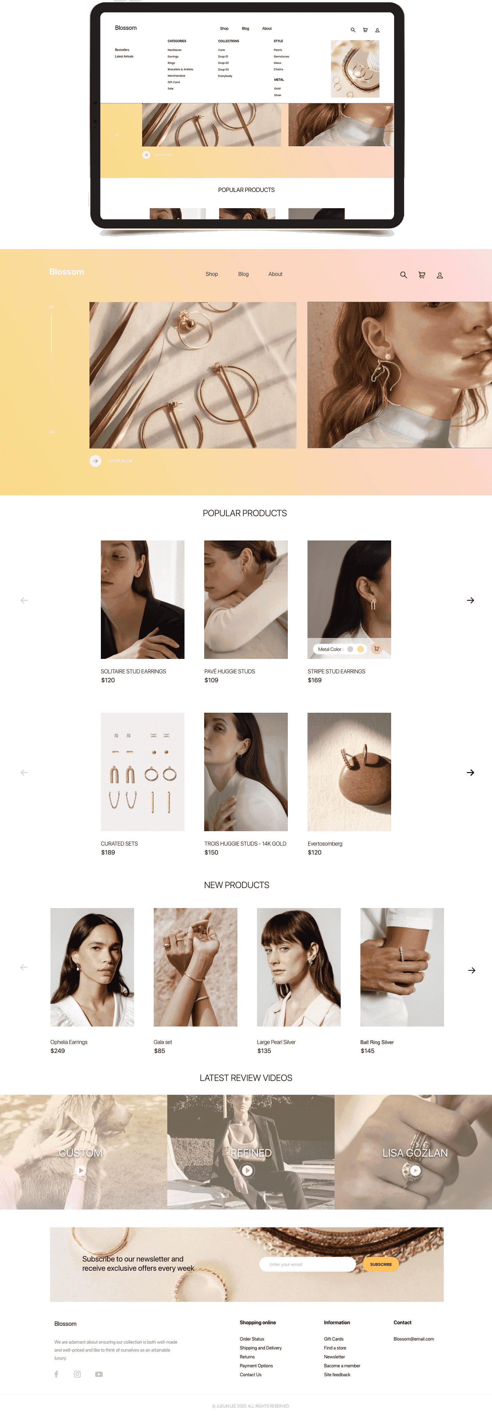
This time I decided to take a shot at e-commerce and redesign this website. Blossom wanted a website redesign that would appear to a more broad consumer audience. My goal was to come up with simple yet smooth user experience.
Orignal Web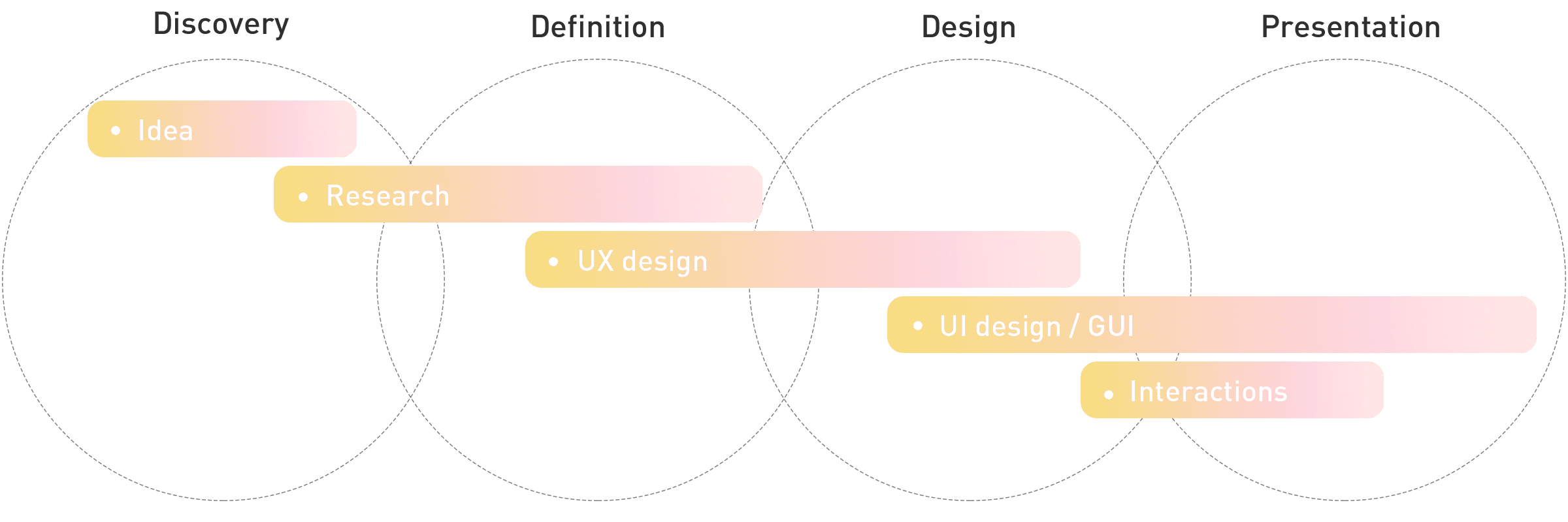
To get a green light on the project I reviewed many of e-commerce websites. I focused on looking into different things: website performance, audit of all pages, which ones were the pages that had more visits, which ones did not.
1) Inconsistent user experience
2) Many leaks at the top of funnel
3) Inconsistent branding
1) Get built different styles of components or blocks
2) A cleaner, lighter functional site
3) Make pages more accessible
4) Clear brand identity across the site where visitor understands
what brand is
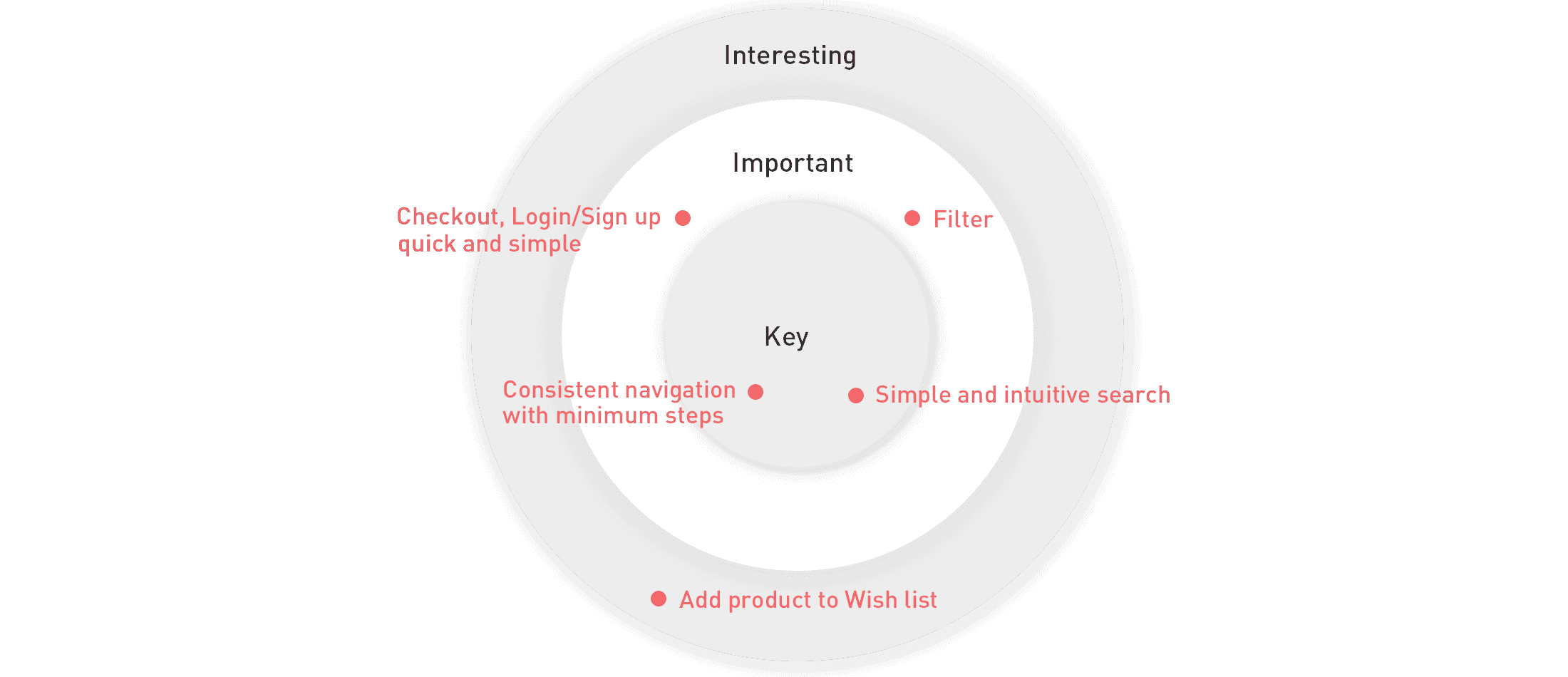
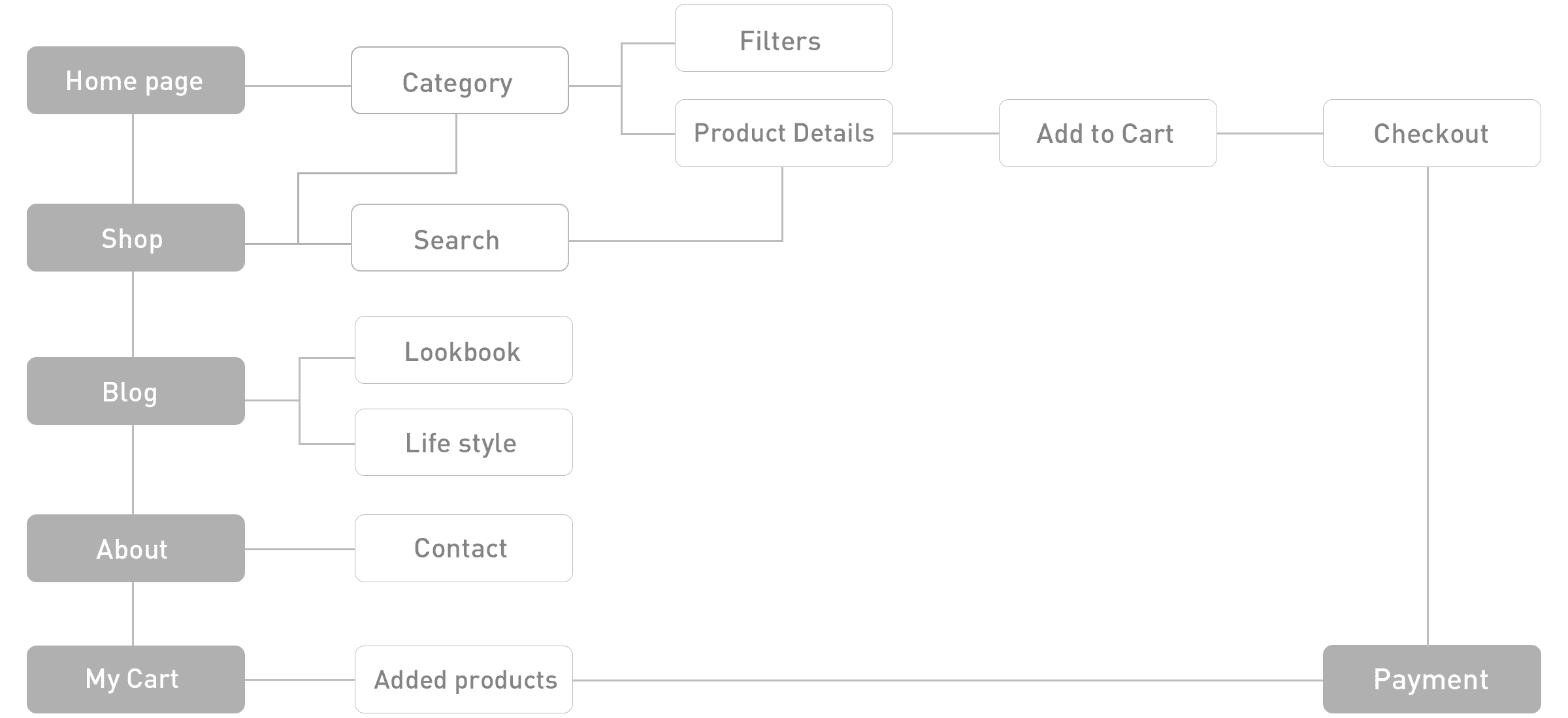
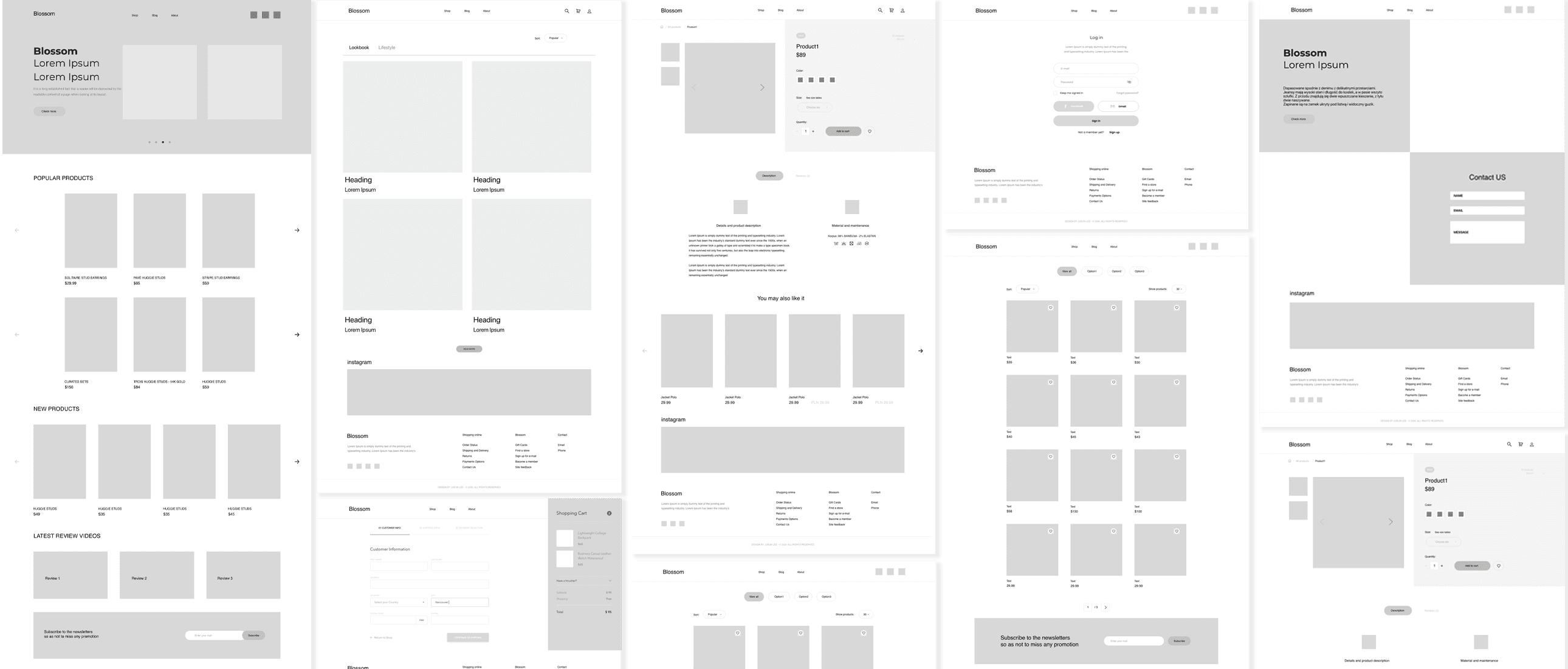
After brainstorming, I started with a study of competitors websites, analysis online stores and especially the production and development wireframes of all pages.

The main page includes a large preview of new collections with a quick jump to the product card and a quick add to the cart button.

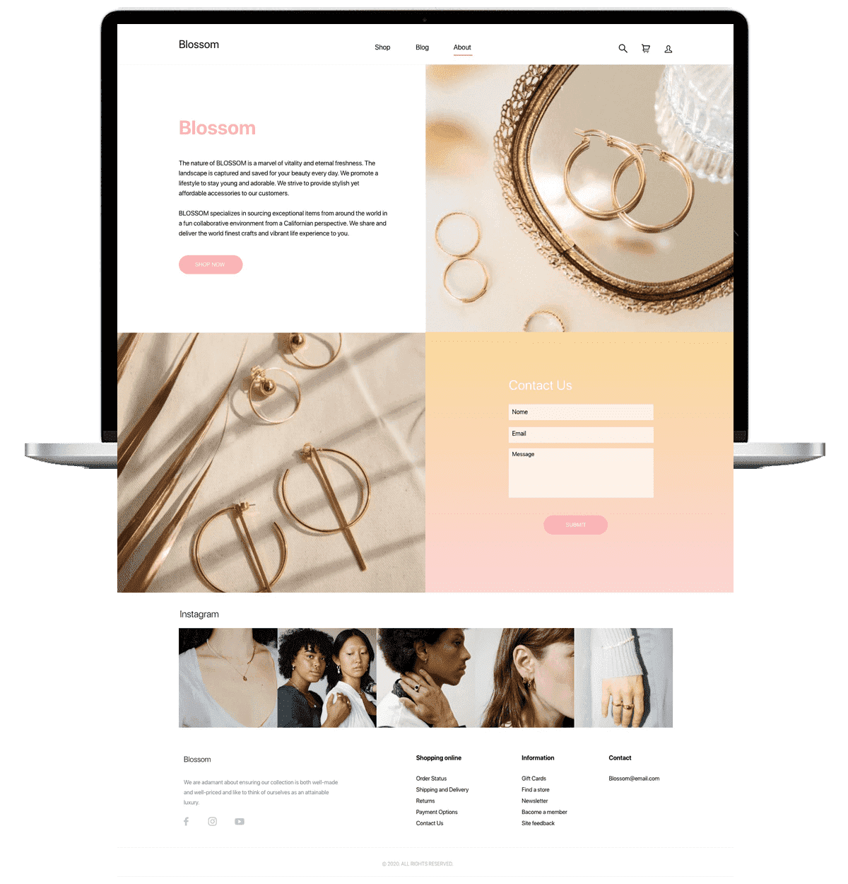
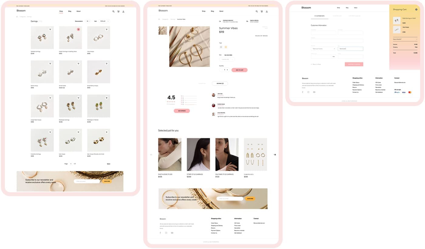
When you hover the mouse over a product, an extended product card opens with the ability to quickly view and add it to the cart. Also, if offers related popular products that you might like.
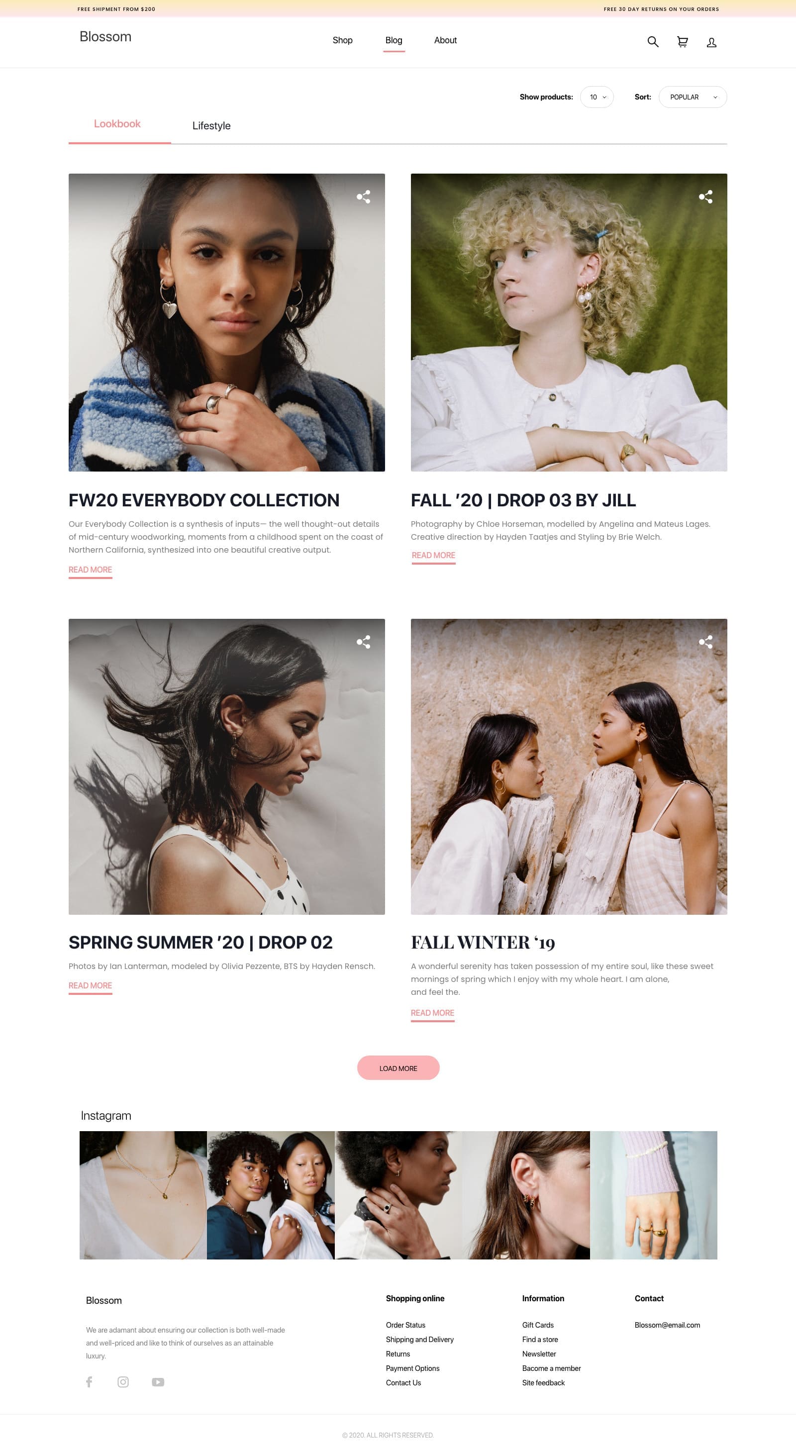
In order to ensure the website content reflects the brand's identity, I added this blog page. so users can understand the brand's identity. all posts are about lookbook, lifestyle.

The website is also responsive for mobile devices. Responsive design, which offers a much better user experience, can help convince people to give the brand a chance.