Main Page
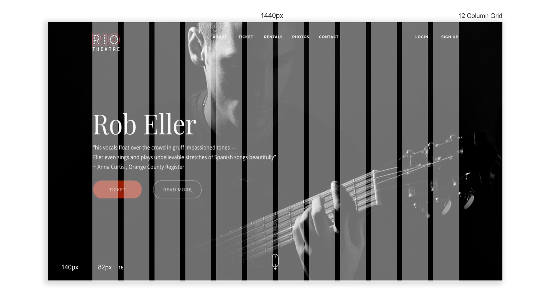
The main page of the website, where we can see upcoming shows and transitions to all sections of the website. It includes all main blocks what make the site navigation easier for users.
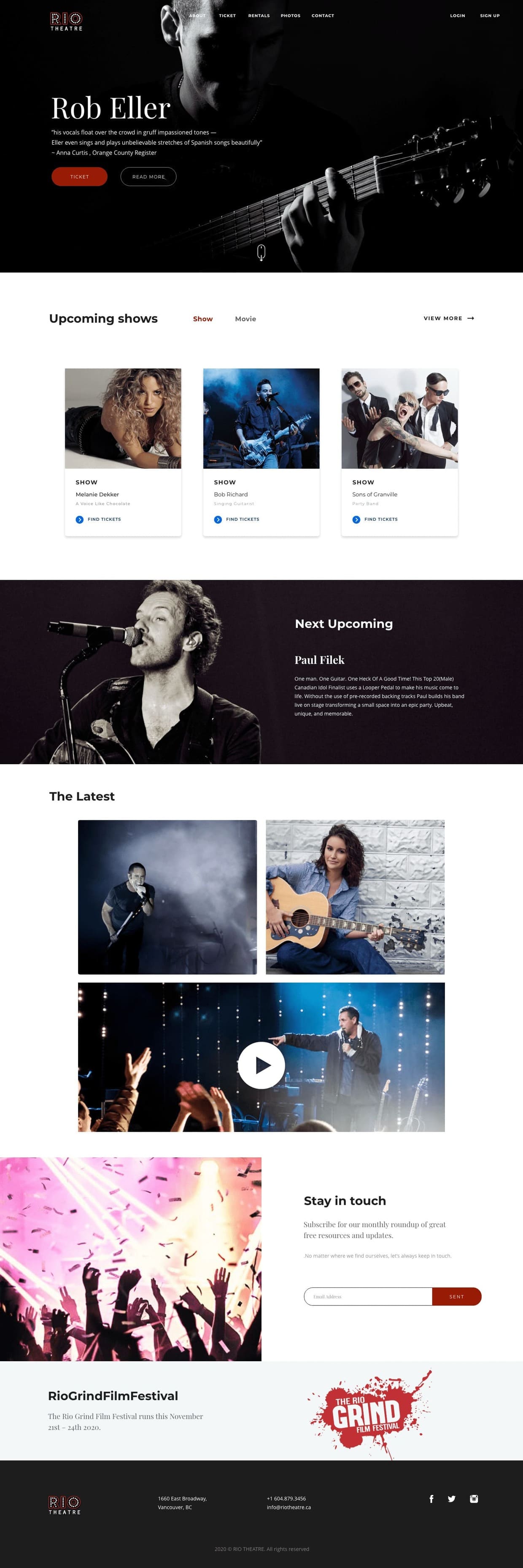
The aim of this project is to examine and improve the user interface of the theatre website. Specifically, the goal is to transform the appeal of prospective users interfacing through mobile device screens.
Orignal Web Redesigned Web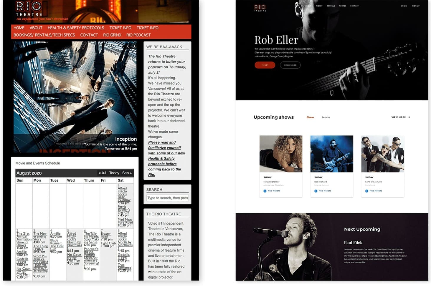
1) Understanding present scenario and pain point.
2) Evaluating existing website based on heuristics principles.
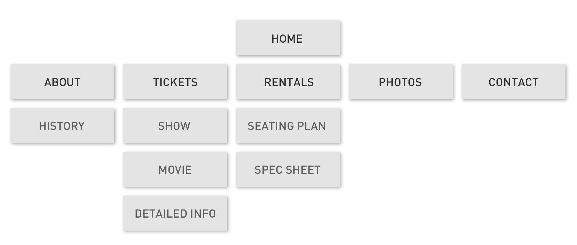
3) Task flow and information architecture.
4) Wireframes based on the new information architecture.
5) UI design based on the new wireframes.
After going through different theatre websites, I saw major UX problems in many of them. I chose to focus on the experience in one of the oldest theatre companies in Vancouver, Rio Theatre, as a basis for the problem I wanted to fix.
- Ordering the tickets in many websites often felt like navigation
in a really long and frustrating process.
- The Rio Theatre had an outdated website which was difficult for
users to navigate, and confusing to use.
- The original website was not responsive to user inputs, which made
the user experience inconsistent.
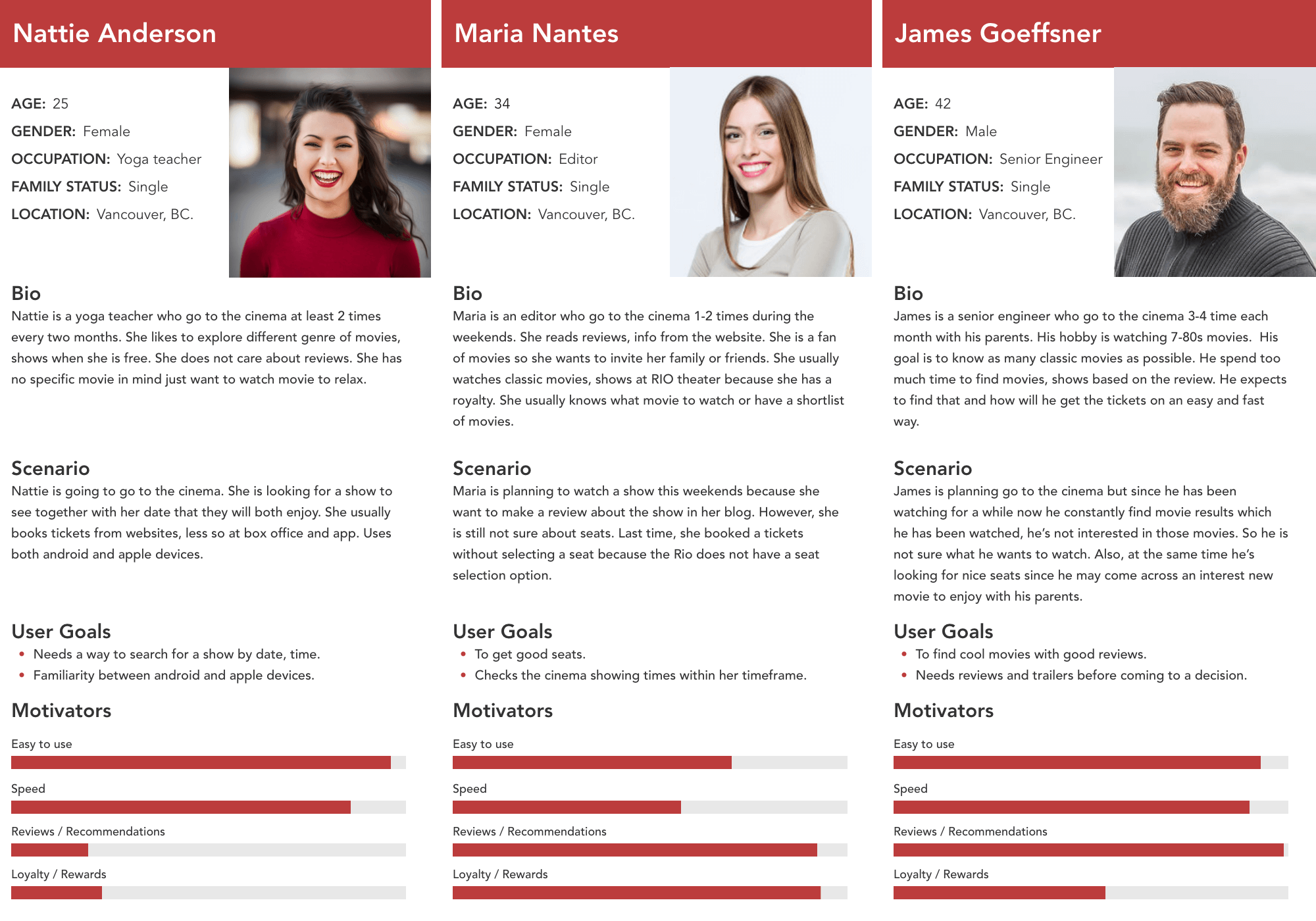
In order to build realistic user stories, I surveyed 8 people, aged between 21 to 45, who go to the cinema at least once every two months. The questions focused about the last time they went to the cinema. Main takeaways:
1) Five said they wanted to watch a specific movie, show so they
were looking for the right time to see it.
2) Two said they wanted to go to the cinema at a specific time of
the week, so they were looking for the best movie available at that
time.
3) One said she wanted to go to the cinema during some evening this
week.
4) All of them wanted to go to a movie around their
living / working area.
After making a few assumptions myself, I joined it with some more questions I asked in the survey to support / contradict my assumptions with data, and help me find the major and minor pain points. The current web does not support any of the user stories really well. It forces the user to give all the exact details (specific movie, specific date, specific hour).
1) 6/10 complained that the process feels too long.
2) 4/10 complained about not having the seat section after going
through the entire process.
3) 2/10 complained about a bad balance in the visual hierarchy.
4) Other complaints mentioned the app’s low speed.
1) I made it easier to make the choice of splitting the browsing function, to ‘Search by Genre’ and ‘Search by Date’. Doing this made the UI for both simpler and easier to navigate. Users task is to choose a movie, show and a day / time of day. I decideed to spread all the choices using big buttons that will be easily understandable to everybody. Every choice filters the available movies, and highlights the relevant screen times.
2) The main goal of this redesign project is to revise the UX/UI concept in favor of a more minimalistic, modern, and easily perceptible solution for users. The new website design makes it easier to find information about showings, and has a cleaner user interface.
3) I made the website mobile-friendly by improving the way it appears on both small, and large screens. So I increased the amount of time that users spend on the website.
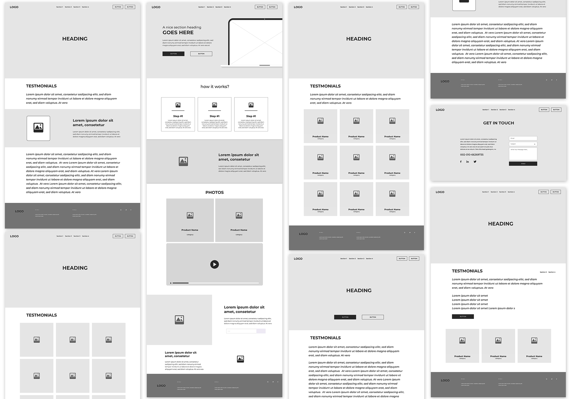
After brainstorming, I started with a study of competitors websites, analysis online stores and especially the production and development wireframes of all pages.
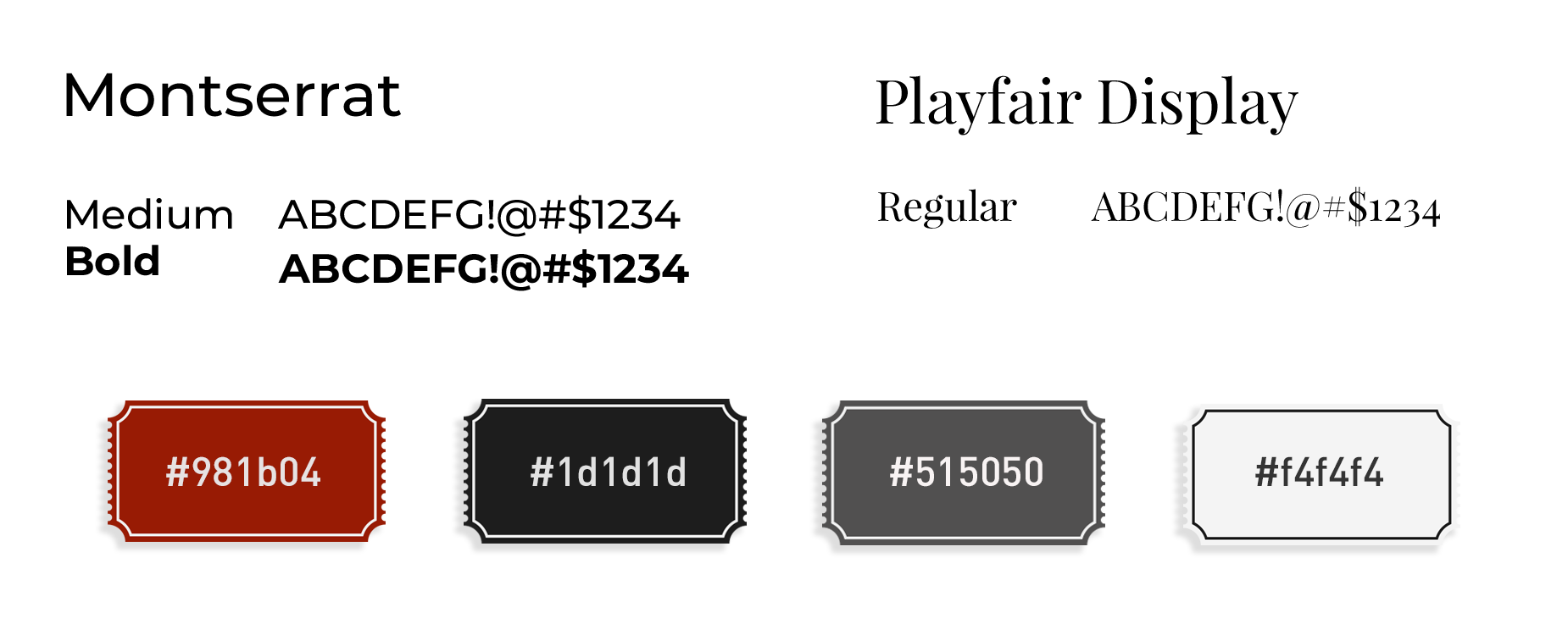
The main page of the website, where we can see upcoming shows and transitions to all sections of the website. It includes all main blocks what make the site navigation easier for users.

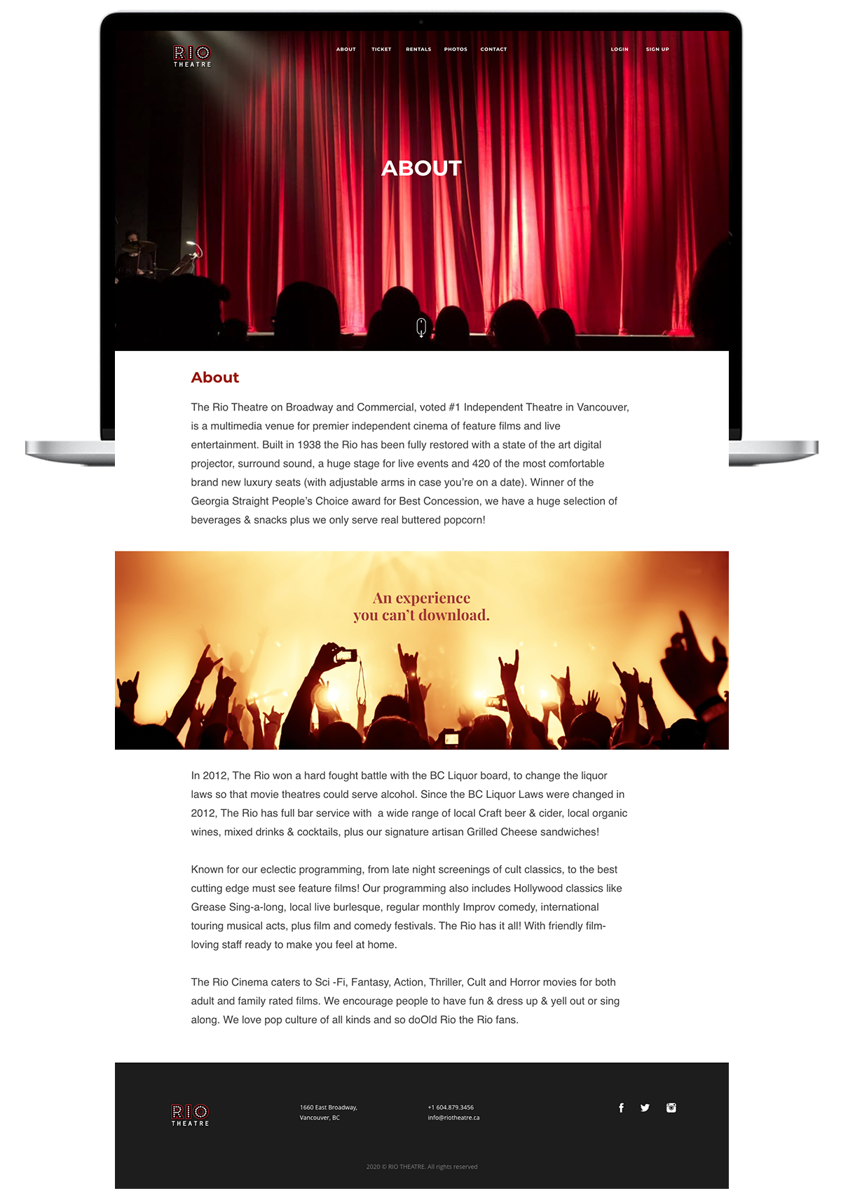
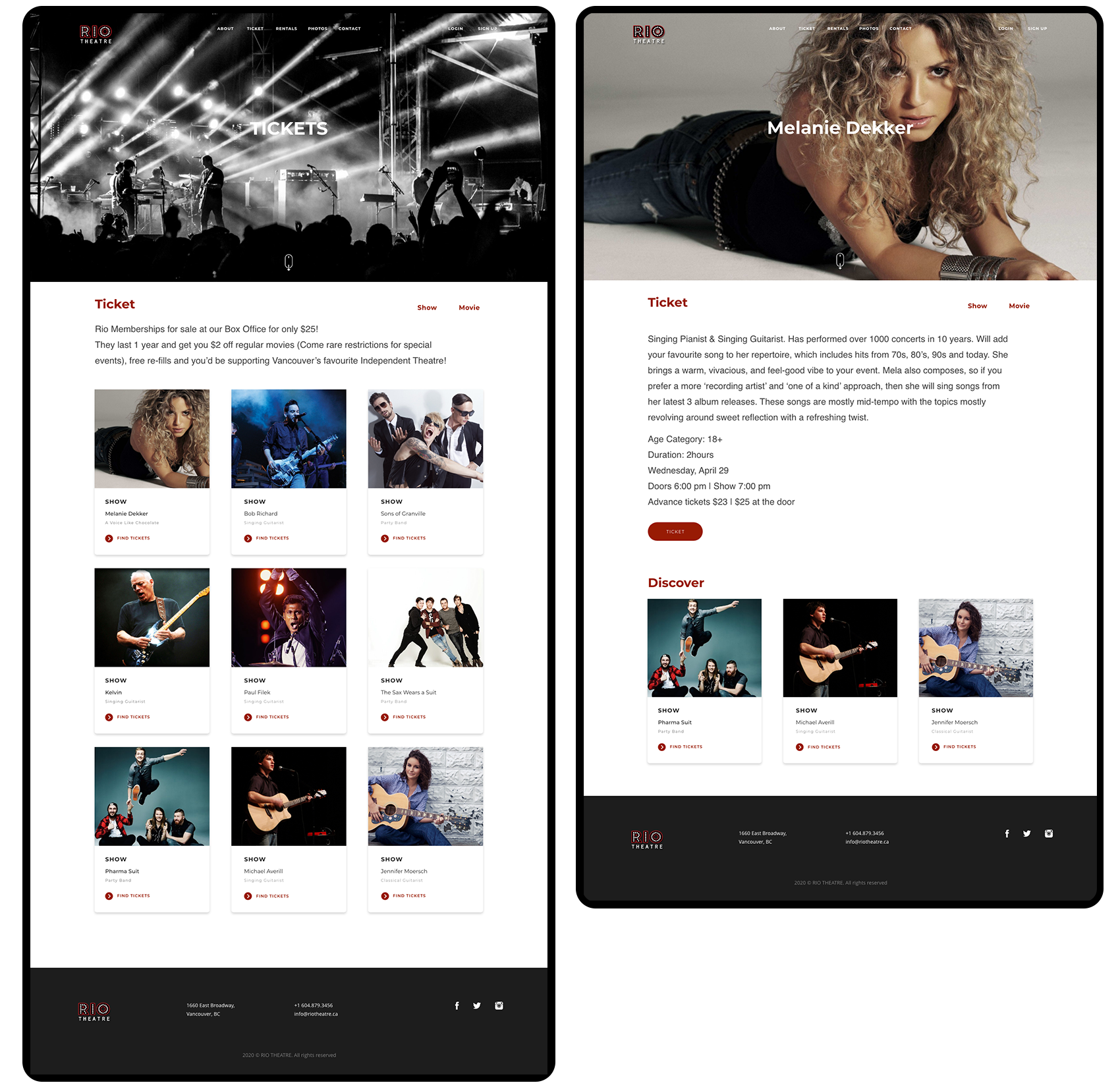
List of upcoming movies, sorted by date and time of the show in the theater.
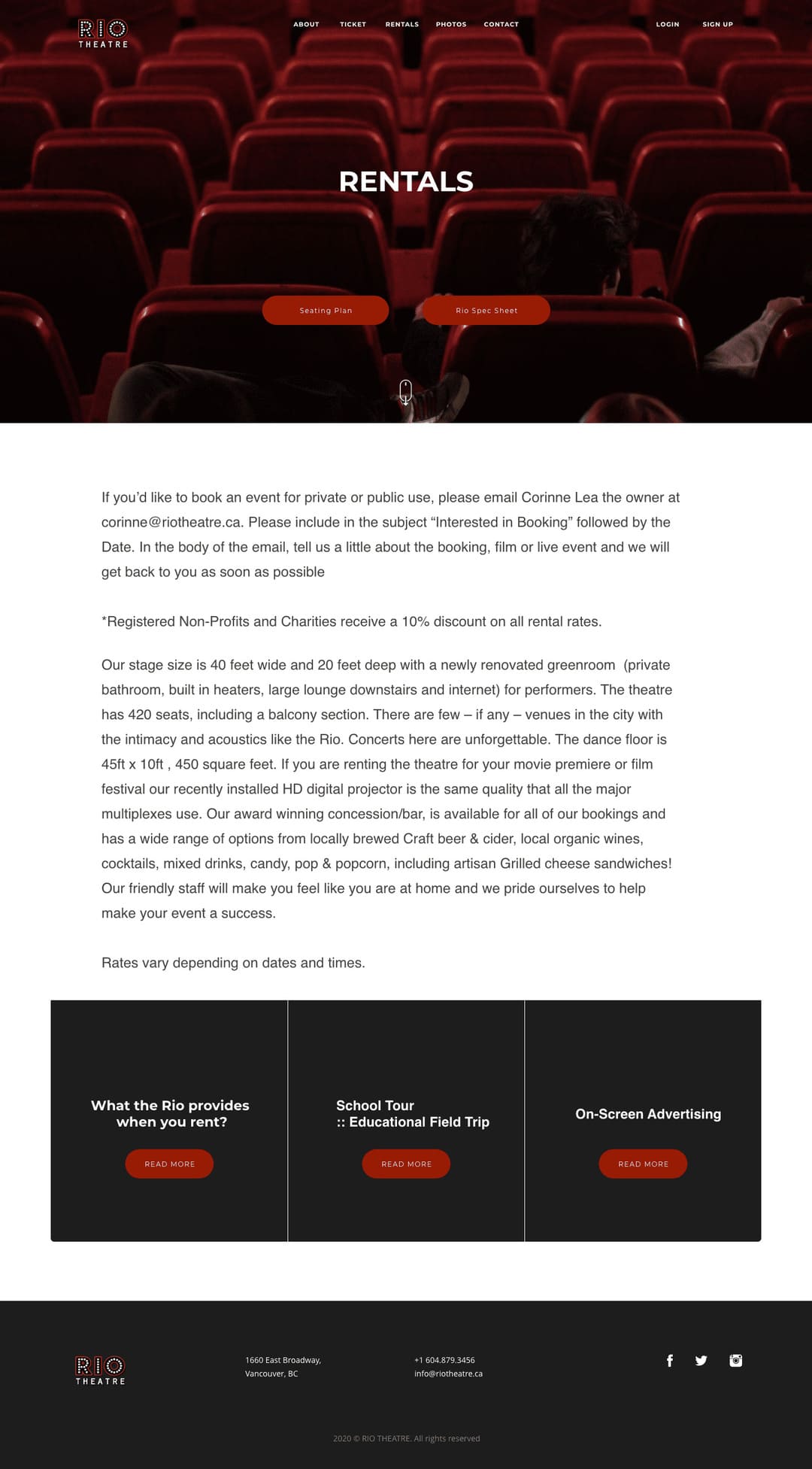
This page for renting the place. Allows user to check a seating plan, spec sheet. Also, There are blocks for main questions. Because of UI details now the page look modern and clean.
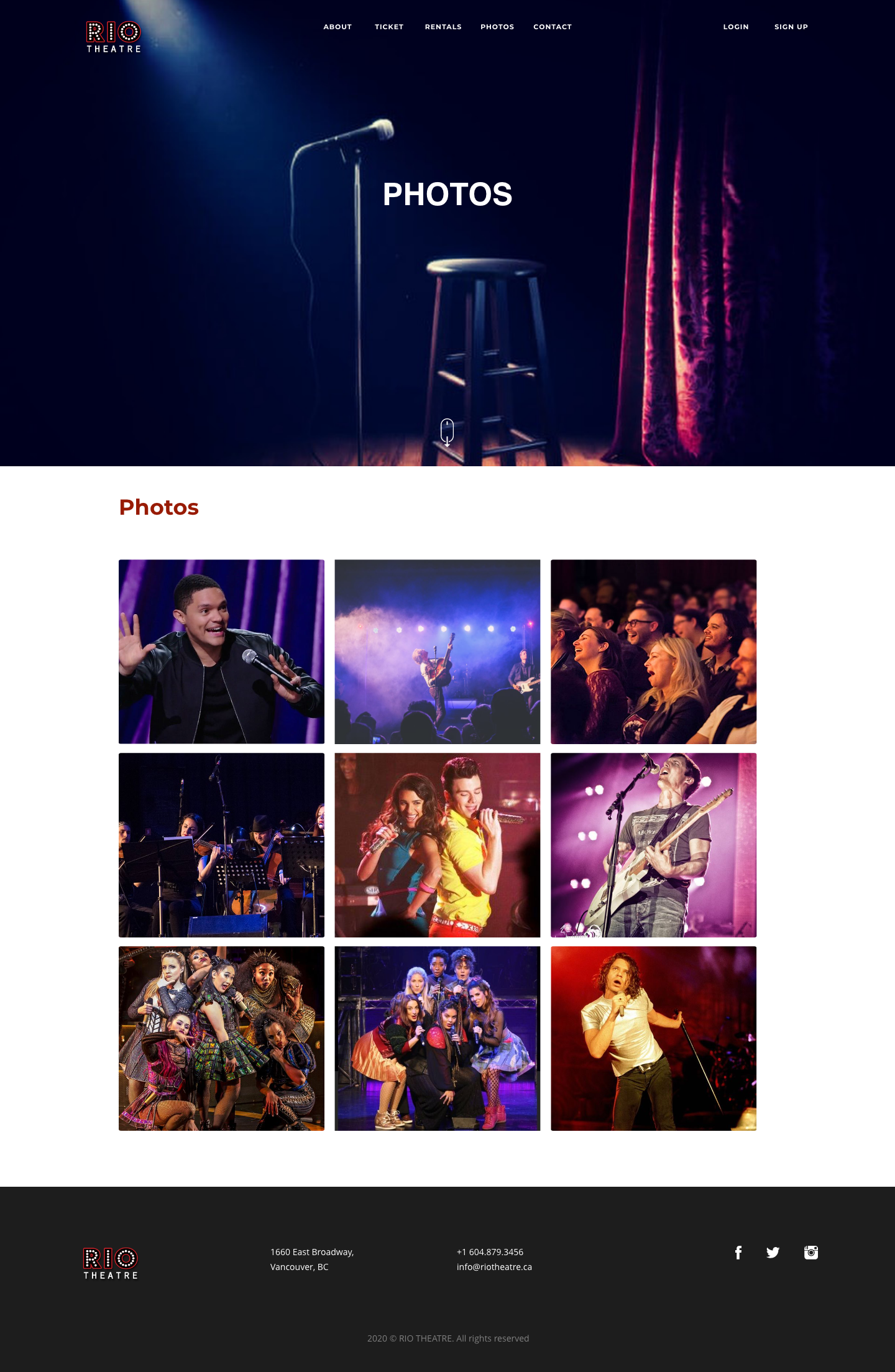
Users can see the best moments at the theatre.