Color
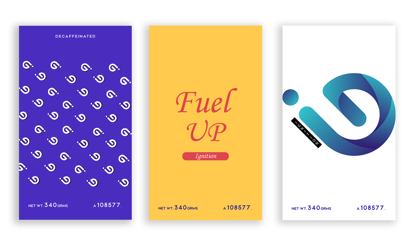
Mainly I used vivid orange, red because those colors are warm color. Using warm colors in my design reflect happiness, enthusiasm, and energy. Also, Diesel fuel is clean of yellow. Gasoline fuel is clean of slightly amber.

Logo Design
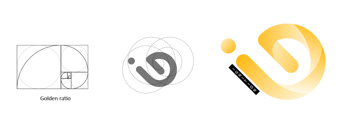
I have created this logo entirely based on the Golden Ratio. It helps me sketch out the proportion and shape. The result? Simple, balanced.


