Overview
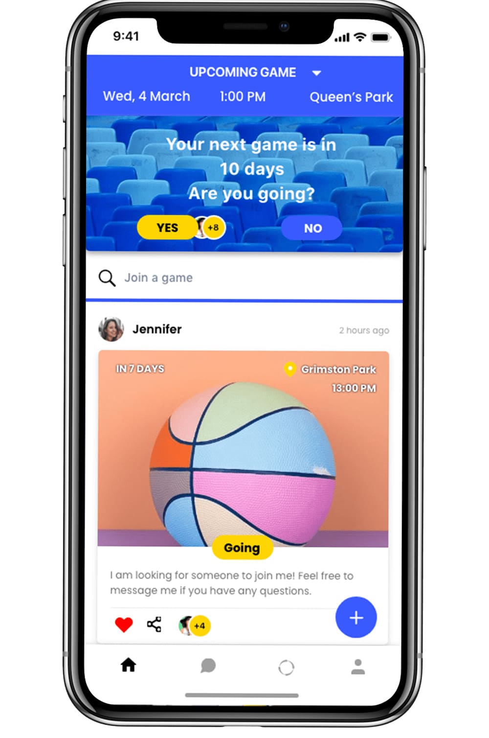
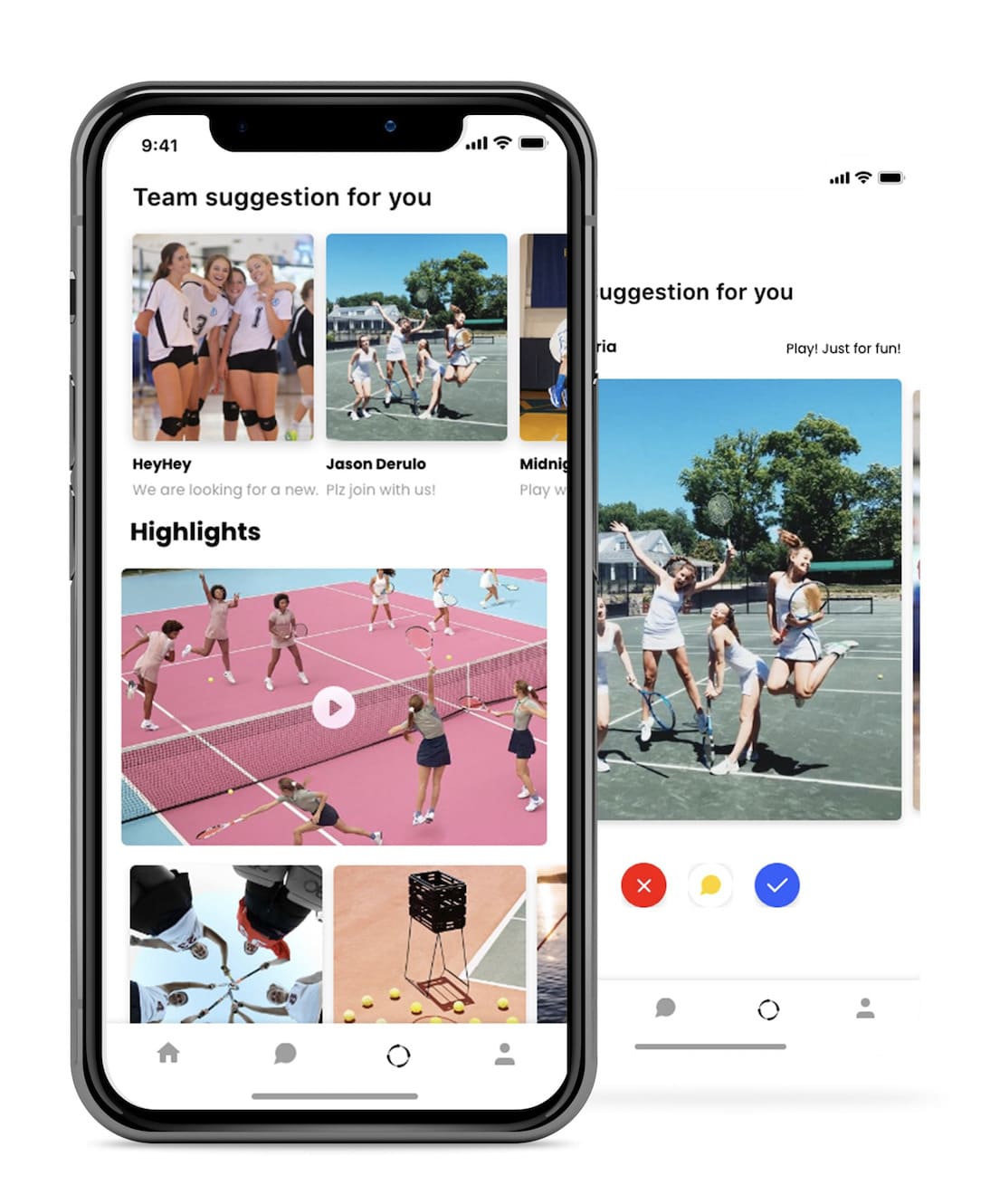
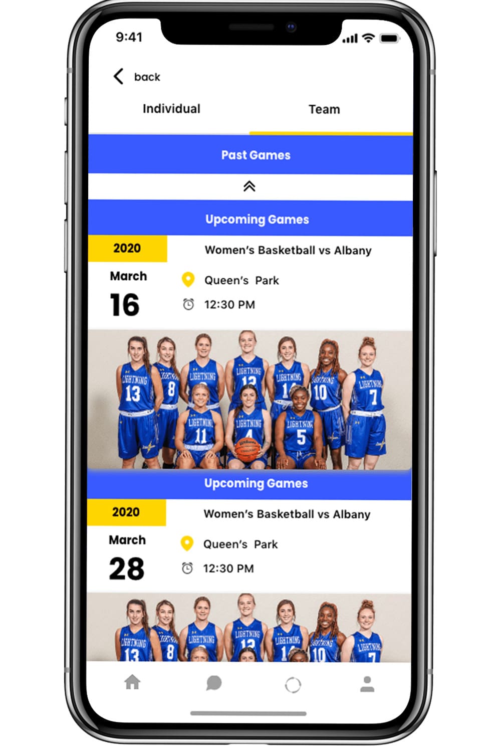
The main goal of this concept is to conceive a product that is capable of managing game schedules, and finding the perfect team for the user.
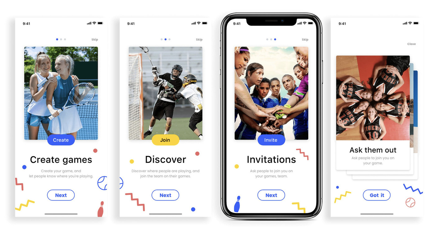
There are four main features that I’ve included:

Design Process
I followed the user-centered design(UCD) process. I was focused on
the users and their needs in each phase of the design process.
I involved the users throughout the process with a variety of
research and design techniques so that I could tailor a product to
their needs.

User Interview & Survey
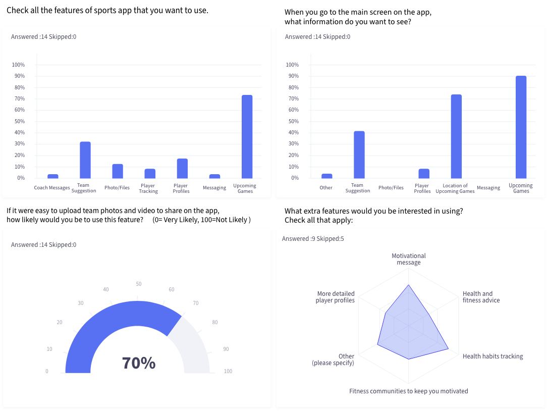
I conducted one survey with 14 participants, and six interviews with 6 potential users. I asked them about their pain points, needs, wants, and routine for their team.
3 Key Takeaways from the survey include:
- By far the most important feature is upcoming games (location,
time, who’s attending, etc).
- People are interested in
uploading and sharing photos and videos with their team, if it’s
more user-friendly to do so.
- People were generally interested in extra features such as health
habits tracking or motivational messages.
Persona
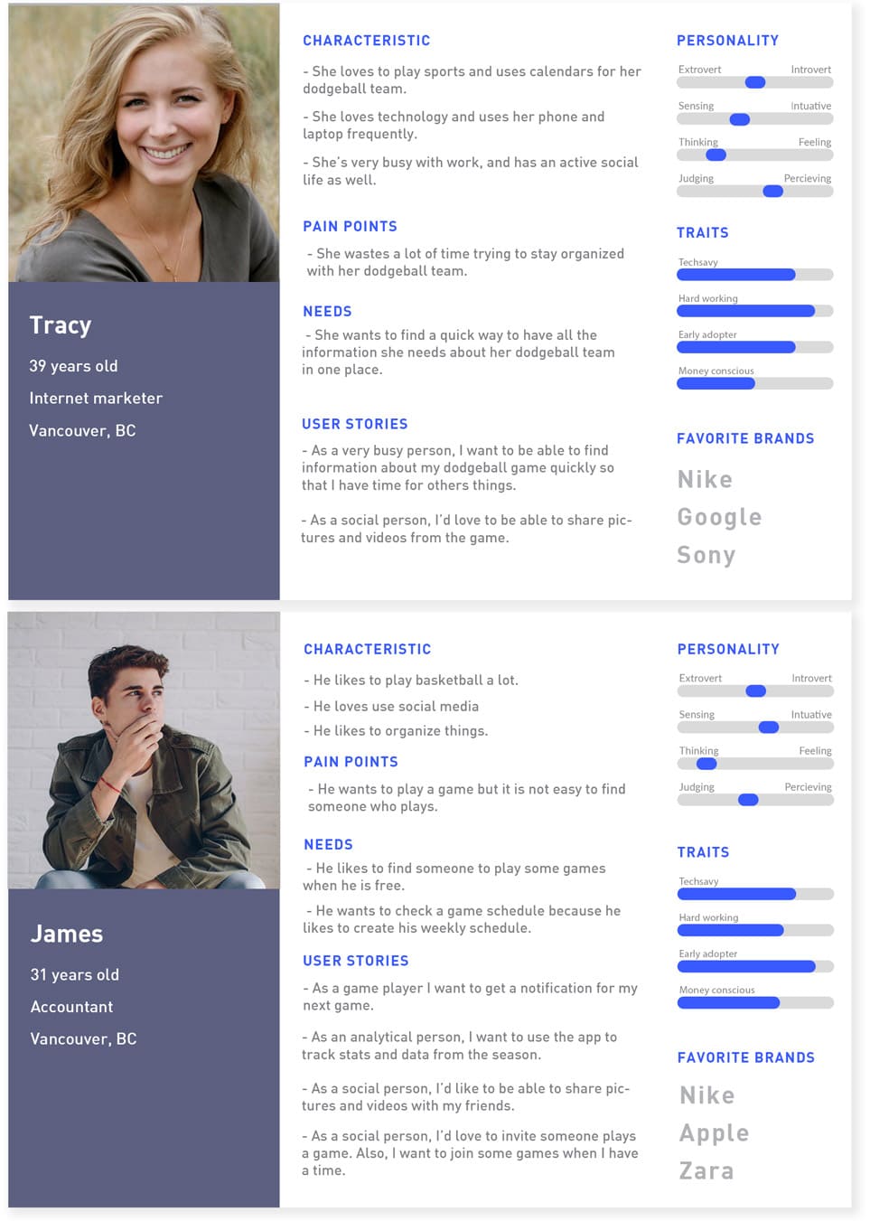
Based on the research data collected, I identified two user types based on their interests and lifestyle. Furthermore, I tried to discover their needs, pain points, personality traits, and favorite brands.
User Journey Map
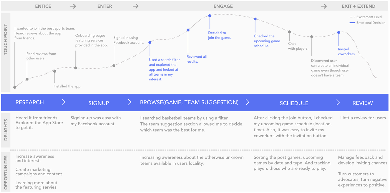
User Flow
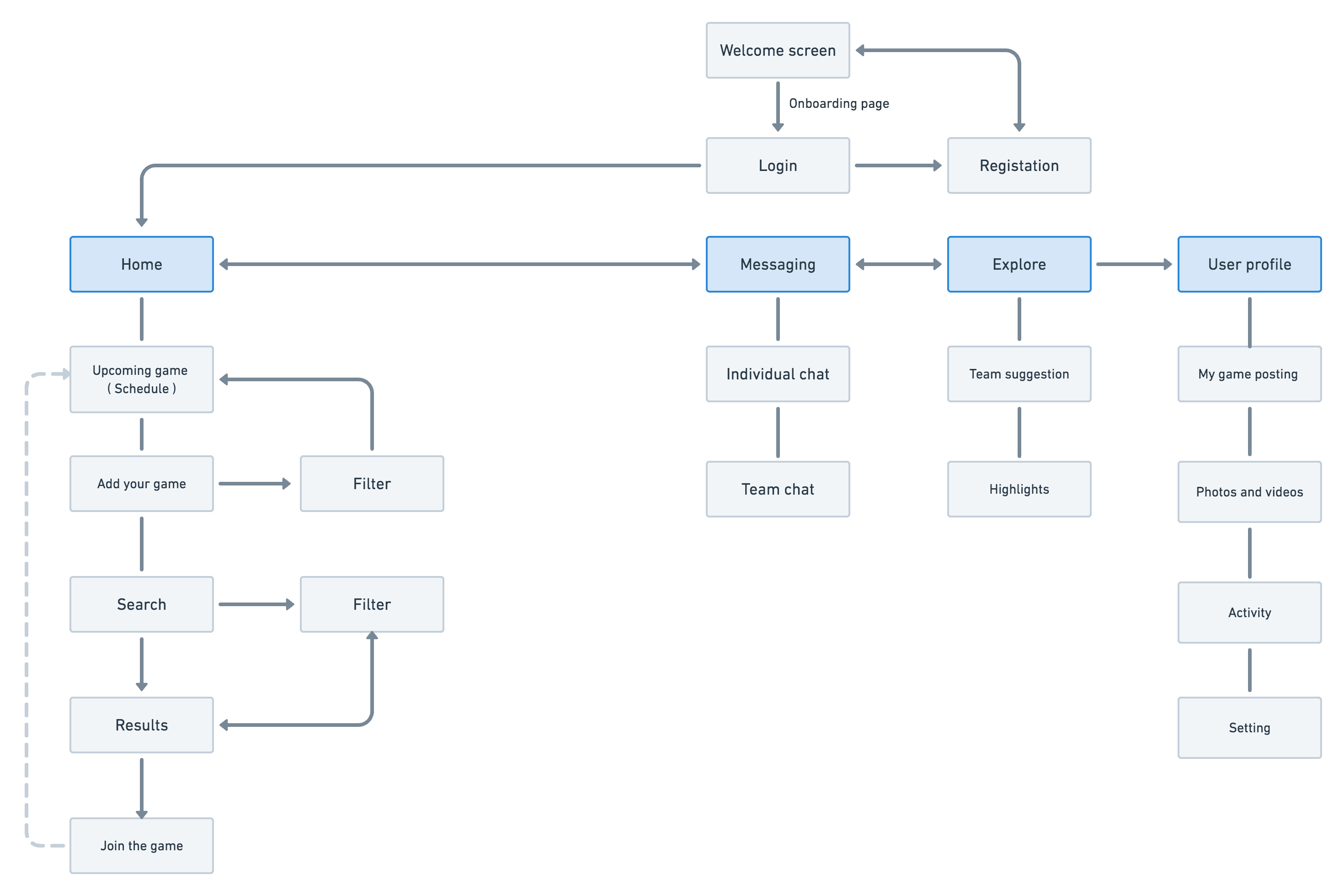
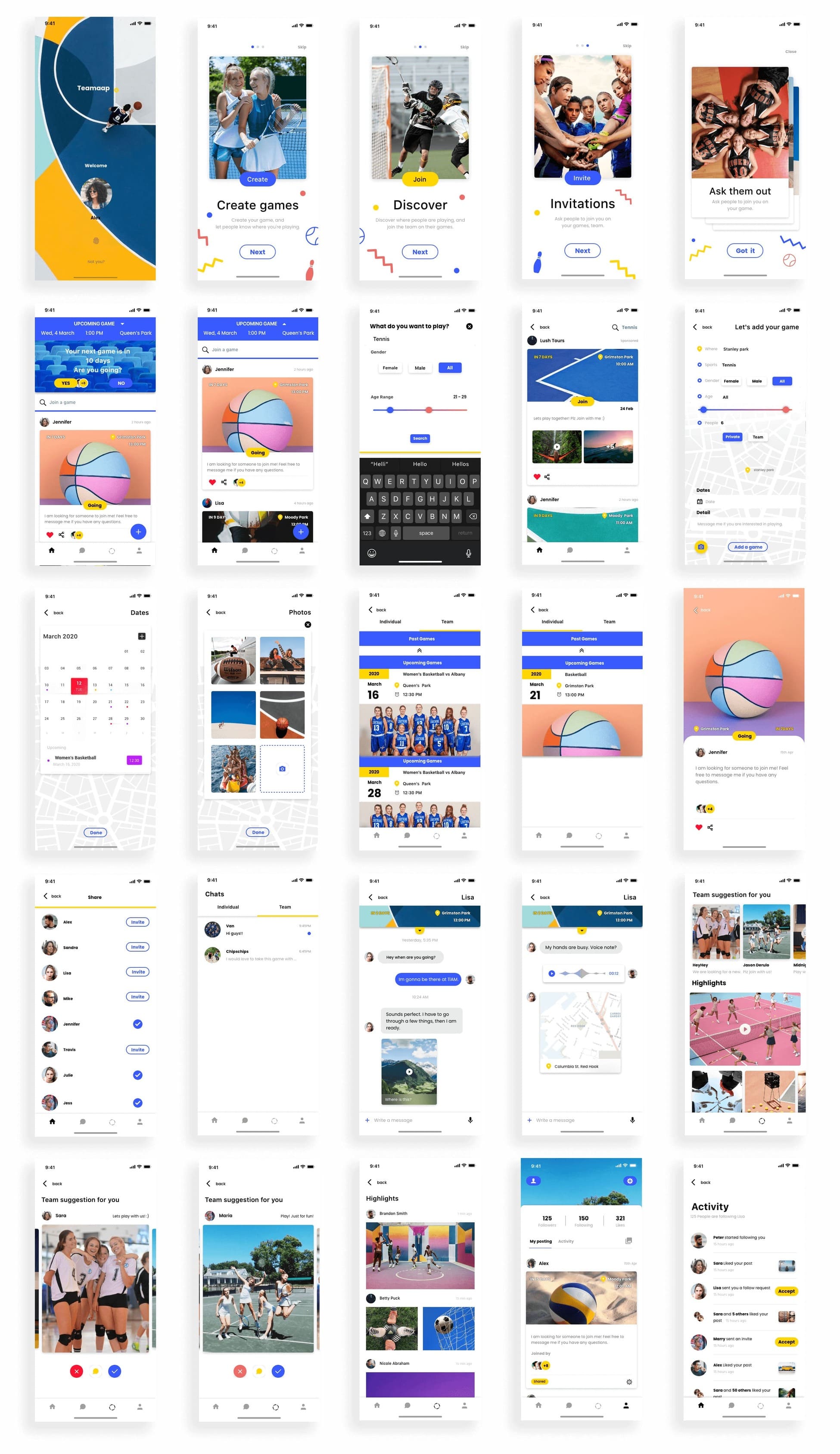
Wireframes
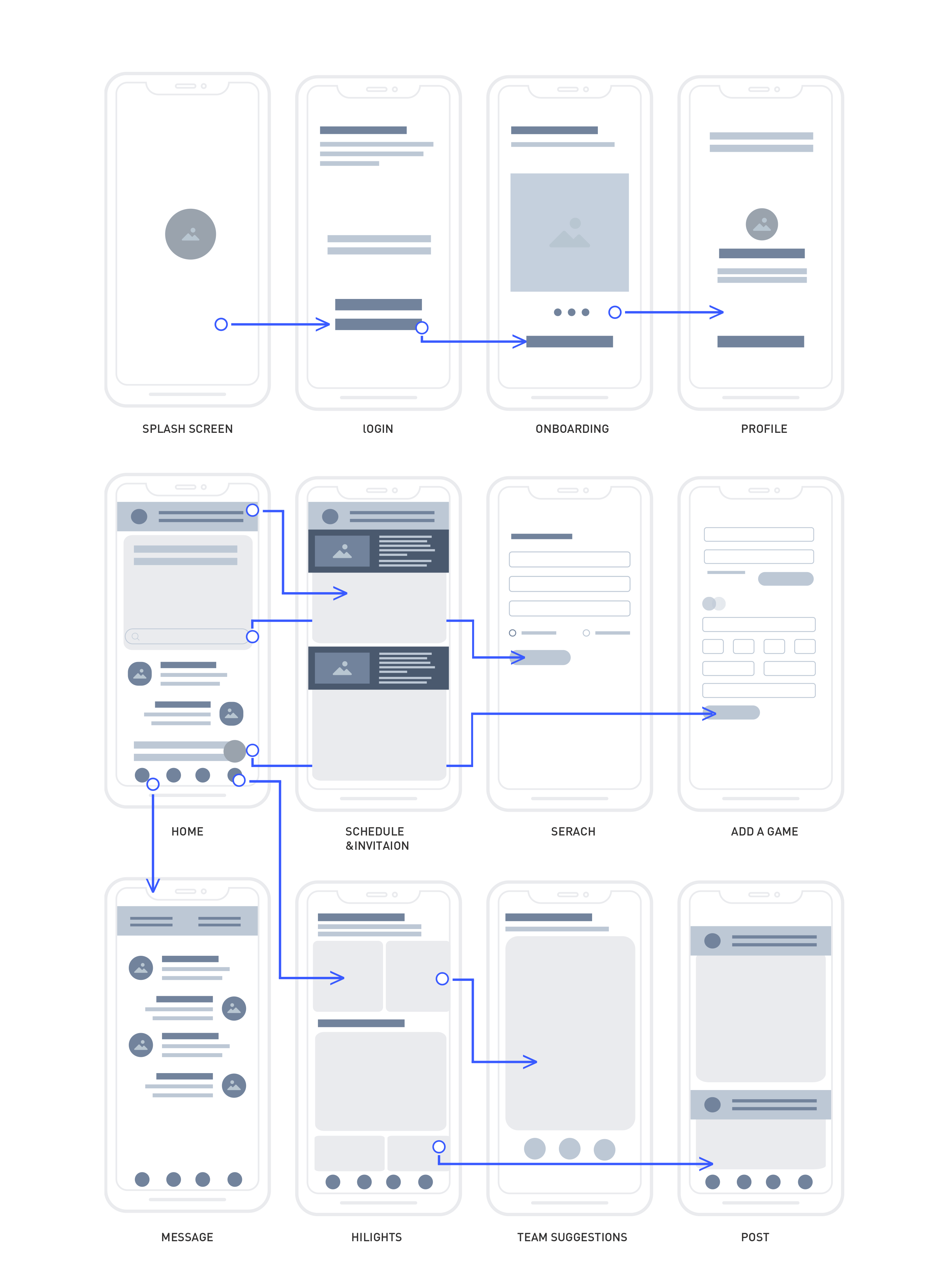
This visual guide represents how the app will look. It helped me arrange the interface elements. Moreover, the simplicity of wireframes allows me to quickly test ideas without diving into the details.
Logo Design
First of all, I targeted a young audience (eg. age 20-35) for
Cheers.
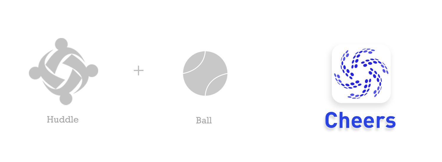
I conceptualized the logo to have a young, fun, and sporty vibe.
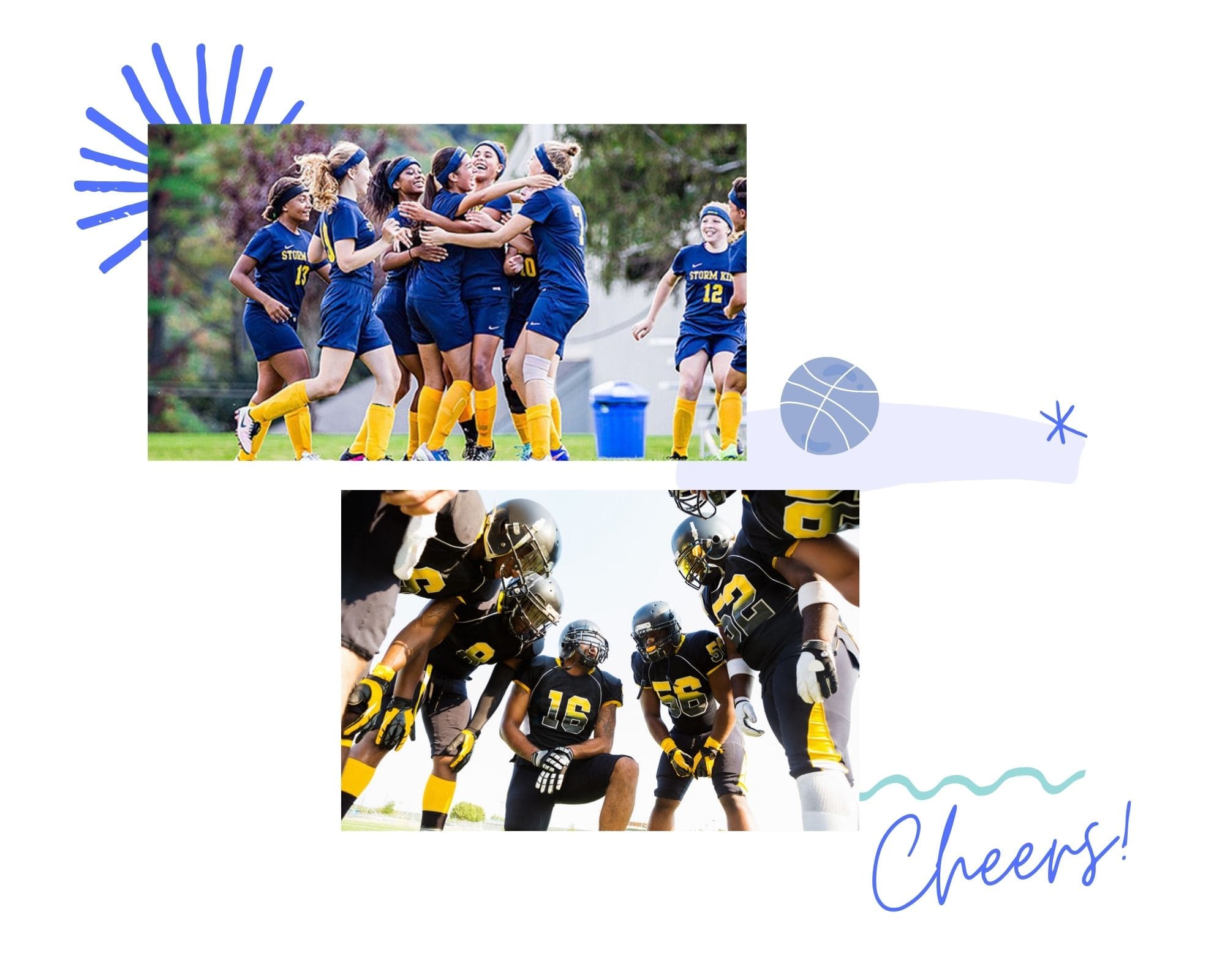
The logo is configured by combining the shape of a huddle with the
shape of a ball.
The shape of a huddle symbolizes teamwork, friendship, and
motivation. The ball symbolizes sports, fun.
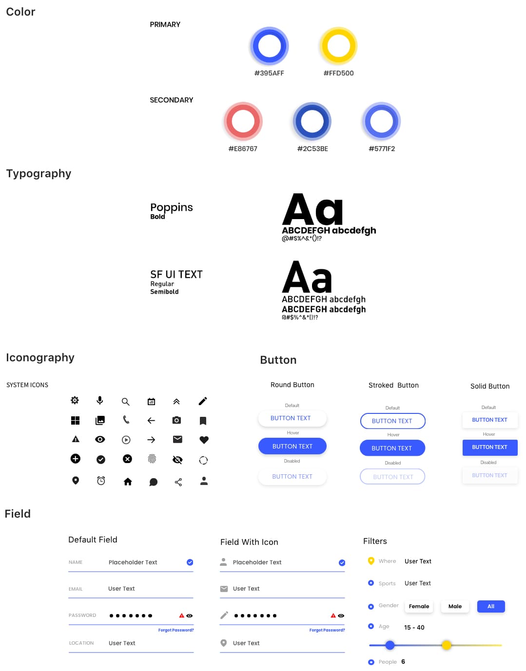
Design system
I chose blue and yellow as they are clean and sporty colors which
support the simple fonts and icons within the app.
I used the Poppins font to set the project’s personality. It conveys
movement, dynamism, and it fits the mood I want to set with the
Cheers app.
The reason I chose the SF UI TEXT font as a
neutral default typeface is because San Francisco font was built to
be a consistently superior cross-platform experience. Also, by using
the SF font, I tried to make the interface feel like the native
interface because it is familiar for a wide userbase.
